My Performance: KPI Trend Chart
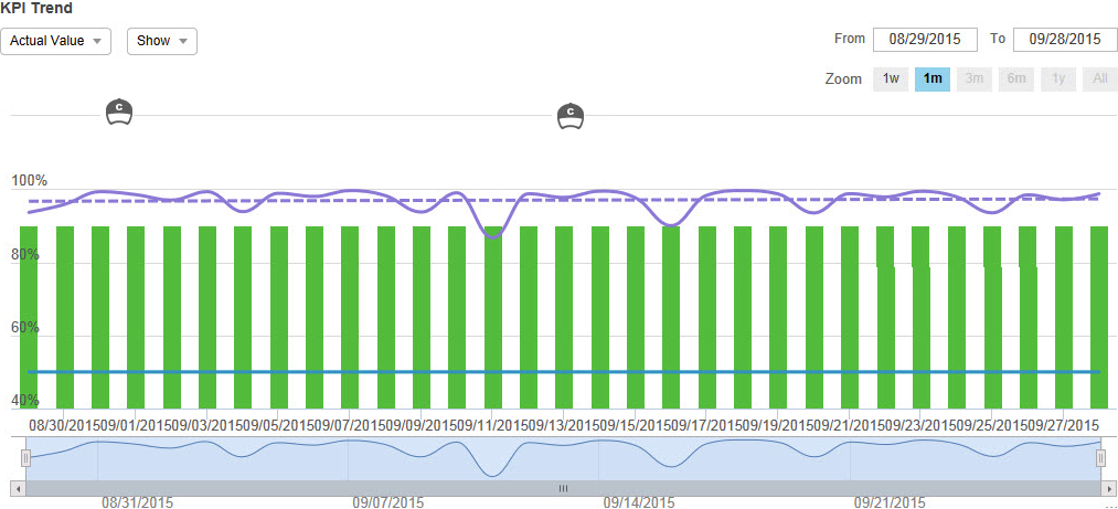
The KPI Trend Chart ![]() in KPI View on the Performance page displays your KPI performance data as a colored line graph indicating the scoring trend over the defined time period. This chart includes interactive elements for date controls, graph lines, and views.
in KPI View on the Performance page displays your KPI performance data as a colored line graph indicating the scoring trend over the defined time period. This chart includes interactive elements for date controls, graph lines, and views.
|
Element |
Description |
|---|---|
|
Date controls |
|
|
Graph Lines and Bars |
Point to the graph lines and bars to view specific data for the KPI based on the defined time period. The displayed lines, bars, and data varies depending on your selections in the Show drop-down list. |
|
Coaching and eLearning Events |
See My Performance: On Chart Coaching Events and My Performance: On Chart eLearning Events. |
|
Actual Value |
|
|
Peer Value |
|
|
Show |
When exporting or printing KPI Trend Chart, the export or print includes the items and events selected to show. The export or print does not include event details. For a periodicity higher than daily, events may occur between the dates of the periodicity. In this case, the events display in between the periodicity points in the KPI Trend Chart. |
|
Bottom Zoom Chart |
Displays the KPI line (not an average of the goal line and KPI line). |