Process AHT Line Charts
Process AHT Chart reports can be accessed through Reports, Process Analysis Reports and selecting Process AHT Line Chart from Report Criteria.
Process Line Charts enable you to compare users or organizations. For example, the Process/Step AHT by User chart enables you to compare users process or step average handling time (AHT) against each other, but also compared to an organization.
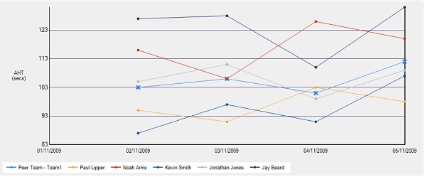
Each line represents a user. The chart clearly displays how the user AHT changes. The blue line, marked with crosses, shows the AHT for a defined organization and can be displayed for comparison purposes.
Select one of the following Report Types: