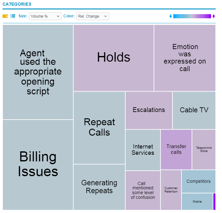
Category tree map
The Tree Map (![]() ) is displayed under Categories.
) is displayed under Categories.
The Tree Map displays trending categories in cells of different sizes and colors, where:
-
Size: Represents Volume%, or the average percentage of interactions that have been assigned to the category for the specified time period. The larger the cell, the more interactions that have been assigned to the category (relative to all other categories).
-
Color: Represents relative change of the percentage of interactions assigned to the category for the specified time period. The color of the cell indicates if the trend is going up or down or if it has a high or low volatility. Depending on the selected trend period (Recent Changes or Long-Term Volatility), the colors vary on the tree map.